Some women look put together even when they are out, walking the dog. Their shoes match their pants and their headbands coordinate with their backpacks. Many women, though, struggle to choose tops that match pants or skirts and get frustrated when prints create creative chaos in wardrobes. You can learn to make matching clothing color less of a chore and turn yourself from fashion tragedy to trendsetter.
Picking Pattern Partners
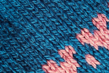
Look for small color details in the pattern when you need to match a print. Note the color of the design element–a predominantly brown paisley might have a few swirls of green. Select a separate, such as a blouse or skirt, in that green color. Usually, selecting a small detail to match works better than attempting to match the predominant color in a print. Selecting a contrasting color to the print background works well. It is difficult to match a color exactly. If a blouse is a cool beige and the print has a warm beige tone, the two will detract from one another.
Neutrals
Neutrals are fashion’s time-out for matching tantrums. A neutral is any color or hue that acts as a backdrop rather than a color standout. Black and gray are classic neutrals. Navy blue and tan also work as neutrals. Patterns that blend into a consistent color when viewed from a few feet away also can work as neutrals. Herringbone jackets or pinstriped pants are two examples of neutral patterns. Brighten your neutrals with pops of color. Choose either cool tones, such as blues and violets, or warm tones, such as reddish orange or gold. The neutrals tone down brassy colors and balance out bright hues. Neutral jackets or pants are good choices when building an outfit. First, select basics and then embellish them with accessories and separates.
Wheel of Fashion

Misty memories of the color wheel from fifth grade art class might help you select articles of clothing that match each other. Complementary color pairs are those on opposite sides of the color wheel. Blue and orange are complementary colors. Red and green are complementary to one another as are violet and yellow. When complementary colors combine, each color energizes the other. The cool side of the color wheel that features green, blue and cyan are good choices if you want to look elegant and refined. Match together the warm hues, such as reddish orange, gold and mossy greens, to create and exciting and vibrant look. Avoid combining cool and warm tones of the same color, such as crimson and orange-red. The cool red will clash with the warm red and each will lose individual appeal.
Accessories
A good way to build a flexible wardrobe is by using accessories. Shoes, bags and scarves all can bring out different characteristics of neutral patterns or color prints. A floral print that features blue, green and yellow will work well with an accessory that uses any of these colors. Do not be scared to add bright handbags to bring some fun to a solid color suit. Shoes do not need to match handbags. Often, a pop of color makes the outfit look polished and put together.